Pages

Showing posts with label glossy accents. Show all posts

Tuesday, 21 August 2012

Journal Journeys Challenge 10

Over on Journal Journeys Dawn gave us a recipe for our challenge this month - photograph of a person, stamps, design papers (DP's) and Glossy Accents.  I'm struggling with creativity at the moment and although I love this challenge I wanted to do something a bit different (of course!).  I knew which DP's I wanted to use - Artylicious ones I got as a free gift for joining the now defunct Graphicus Guild.  

Then inspiration hit after spending the day with Jo attempting to start and sort her new craft room out.  She had some Simply Stamping Magazines from 2006 / 2007.  I'd never seen these mags as I had real problems stamping when I first tried and was put off completely!  One of the mags had a tutorial on paper weaving and that was me inspired!

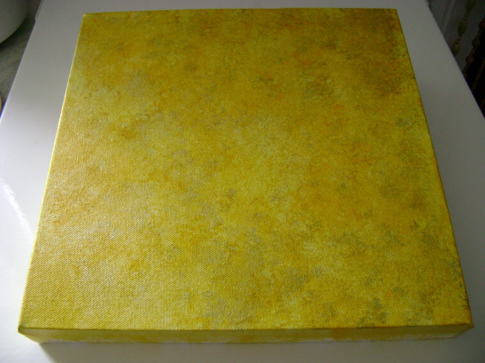
I used Mowed Lawn, Squeezed Lemonade, Peeled Paint and Crushed Olive DI's to cover the background of the page in my Moleskine.  I flicked water over page and mopped it up with kitchen towel before drying it with a heat tool.


I chose a script stamp and swirls in various shapes and over stamped them onto the page using Mowed Lawn and Crushed Olive DI's.  I just stamped them randomly cos I knew they'd be mostly covered by the other elements.


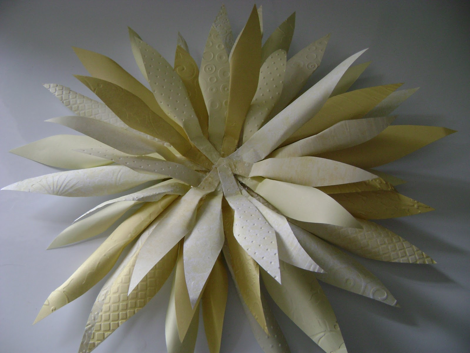
I cut the DP's into strips, some with a fancy edge and some with straight edges.  I then followed the instructions in the mag. 

Place the strips on to a Post it note sticky side up and secure them with another Post it on top.
Then its just a case of weaving more strips in and out of the vertical ones.  Continue til you get to the required size.  Now this is where the mag tutorial was a bit vague.  I discovered that the more strips you add the more strength it has when you turn it over to put some glue onto stick it to the background.  

Maybe I should of attached it to some paper before putting it in my journal but I just stuck it (with difficulty) straight in there!


The next stage was photos.  In 2011 some wonderful women in the North West on England decided to do a (tasteful) naked calender to raise funds for the MS Society.  The calendar was a very beautiful and a great success.  If I'd known about it before it was photographed I would quite happily have joined in too.  I wanted to use those images as they celebrate the female form and also (as my Mam said) you tend not to keep calendars but I'll always have my journal!


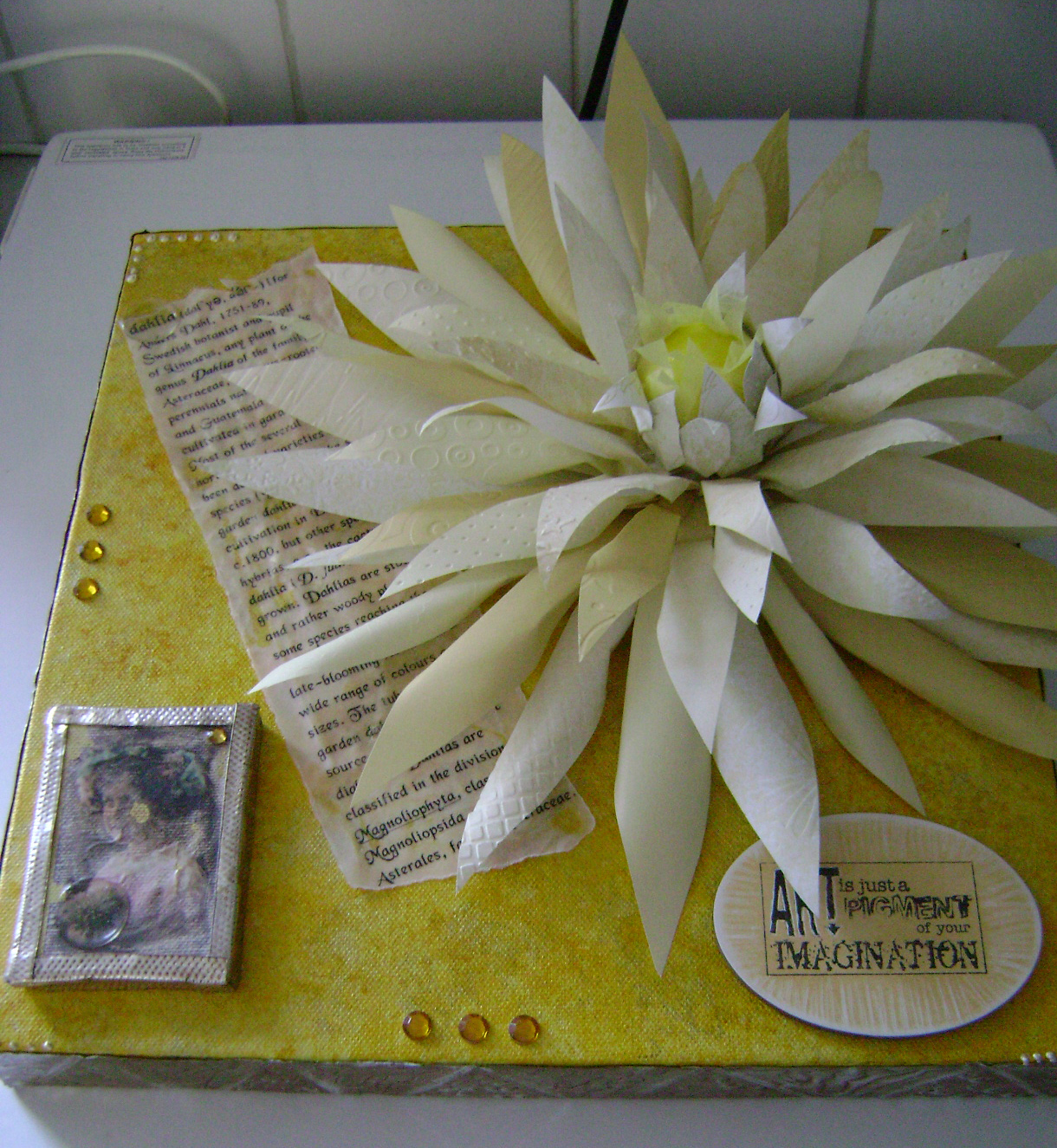
Now came the difficult part. Dawn had said to use Glossy Accents to highlight our fave bits.  Hmmmm......

I used two main images and then cut the thumbnail size prints from the back of the calendar and highlighted the girls in those photos with Glossy Accents.


I matted all of the photos to pieces of the same DP's I'd used for the weaving and stuck them all on.  And here is the finished page


I'm really pleased with the way it turned out ;)

Thanks for organising this again Dawn.  Please hop over to Journal Journeys to see some lovely journaling and maybe join in next month?

Sunday, 29 May 2011

Carrie's Frame

It was Carrie's birthday earlier in May - the big 4-0!!  I wanted to get or make her something special so in January I spotted this frame in a Charity shop window.  The guy in the shop knows me now and when I asked to look at it he automatically showed me the back first!

The first thing I did when I got home, after taking this photo of course, was the take it to pieces and rip the leaves and glittered apple out of it and bin the them.  I couldn't get the glass out as it had been glued to the front frame.  Thank goodness the inside with the recesses came off cleanly!


I didn't need to prepare the surface apart from cleaning as the inside had been painted with some sort of matte paint.  As far as I could see the frame had already been altered into the state I bought it in as the painiting was not factory done. 

I painted the inside of the frame and recess with Viva Precious Metal Paint in Blackberry and then dry brushed the same make of paint in Mother of Pearl over it.  both of thses paints are very high in mica content so shimmer beautifully.  I painted the outside of the frame with Precious Metal in Silver to tie both parts together as the mother of pearl paint has a slightly silver tone to it.  Of course I forgot to photograph them at this stage, but you'll be able to see what I mean on the finished frame.

Next I made some flowers using a tissue drinks coaster and some pages from a book.  I cut both of them with a Nestie circle die.  Especially for S and J at the hospital here are the photos :)

These are the cut circles which have been scrunched up and sort of flattened back out.
The same circles which I have sprayed with Glimmer Mists in Key Lime Pie and Lemon Zest.
And again once they have been dried with a heat tool and ready to shape into a flower around a bead.   Lynn R-H taught me the technique at a workshop.  You start with a bead and a little glue and mold the paper around the bead.  Keep doing this with tissue, paper and glue until you have a flower of the size you want.

  
 And this is a close up of the finished flower.  I made the beads for both of the flowers during a workshop that Carrie, Jo and I attended and had a great time!

I chose bobbins to into the recess as Carries loves sewing.  My Mam wrapped the thread round 2 of the bobbins and I painted the 3rd and put a vintage cigar bad round it with a picture of a german castle on it.  Carrie also loves Germany.

This flower was made in the same way but sprayed with Jazz Blue and Fully Purple Glimmer Mists.

My Mam helped again by filling the miniature bottles with lavender grown in my garden and tied ribbon round the tops to finish them off.  The ribbon is from the loops you get on clothes to keep them on the hanger.  I cut them off and use them for projects!

Carrie love the outdoors and I thought the Lavender would be perfect here.

Placing the bobbins and bottles was difficult as I was shaking while doing it.  Thank goodness the Glossy Accents has a little time before it dries lol!!!


For the middle, I made a torso from pearl UTEE (Ultra Thick Embossing Powder) using a mold Jo has. It has a front and back to the mold but I just used the front.

The 'pedestal' that the torso is to stand on is a piece of dense foam from the bottom of TH Embossing Folder packaging.  I've been keeping it but didn't know why til now ;)
I painted the pedestal the same colour as the recess and stuck the whole angel together using silicone.


Then it was just a case of cleaning the glass up, bearing in mind I couldn't get it our of the frame.  There was gold paint on it from the last time it had been painted and somehow I'd managed to get the Blackberry colour on the inside of glass right in the middle.  So once I got that off and gave it a good dust, I could put it all together.

Here is the finished frame and it is totally personal to Carrie!

Sunday, 3 October 2010

Yellow Cactus Dahlia Canvas

Sorry I've been so quiet.  I'm having quite a hard time at the moment due to nueropathic pain caused by my MS.  I've got an appointment on 20th October at the Pain Clinic to see if they can help.

Anyhoo enough of my woes.

Last week a family friend, Keith, who has an allotment near my parents left a plant pot full of dahlias in their back yard.  He gives us some every year after the Leek Shows, after I told him a few years ago how much I love them.  You can see from the photo how wonderful they are!


A couple of years ago, Keith was doing some work in my house and I had some Stambord blocks that I had not long finished on the hearth.  He was fascinated by them and the rest of my artwork.  I offered to make something for him and he asked if it could be based on a yellow cactus dahlia he grown some years previously.  He gave me a tattered photo taken before digital cameras with the dahlia in the distance.  This is a close up of the yellow cactus dahlia he gave me this year (complete with greenfly!).

I first drew out what I was thinking and added some ideas for materials.  It still shocks me at how good the drawing turned out, as I couldn't really see the dahlia in the photo, so I drew this image from memory.

I knew I wanted the flower to be 3D, so working out how to do it became a real challenge.

I decided it would be best shown on a canvas, so I coloured a 12x12 deep edge canvas with various yellow and green paint.  It was so long ago I can't remember what colours or even paint I used, but I know I used a scrunched-up piece of copier paper to add green to the mix.  I didn't want the colour of the canvas to be the main focal point.

Next I hand drew some simple petal shapes onto acetate and cut the centre portion out so that I could just draw round the inside of the template to make each petal.  These are for the larger petals and I did a similar one for the smaller petals too.

I sat one night in front of the TV drawing petals onto various patterned yellow scrapbook paper.  Then the marathon cutting out started which took a while as I found it so tiring.  I knew it was going to take a lot of petals but I didn't realised just how many!
Once I cut the petals I went onto the internet to find a close up of the flower to see how the centre looked.  Its very tight with lots of smaller petals opening from it.  After a few days of thinking I came up with the idea of using a polystyrene ping-pong sized ball and painted it yellow.  I used yellow tissue paper to make the petals for the very centre as it gave the illusion of them just having opened.  While I was on the internet I got a definition of dahlia, copied into Word, changed the font and printed it onto vellum to use on the project. 
 
I wanted each petal to have texture so I put most of them through the Cuttlebug, using various folders with some embossed and some debossed.  I then folded the base of the petals behind and secured with tape.  This meant that they looked more like the real thing.  Once I'd finshed all of the petals I started to build the flower.  I built it off the canvas in case it didn't turn out the way I had envisaged.  I used a 2" square of card as the base and stuck the petals to it using silicone glue.  This photo is of the first two layers of petals.  This was when I realised I needed some more so another marathon tracing, cutting and taping session ensued LOL!!!
 
I built the centre layers of the flower separately too in case of error as the base layers were working so well.  I used a plastic cup to keep the centre upright as the ball just kept trying to roll away!!  I first attached the tissue paper but just stuck to the underside of the ball, so the tops of the petals were free to move.
 
As I began the lower layers of the centre I used double sided paper as the undersides could be seen and curled the paper to give the petals more 'life'.  This photo is of the completed flower.
 
I used TSS metal in silver to cover the sides of the canvas.  I just doodled free-hand on the metal with a couple of the TSS tools.  I needed to colour the metal to make it tone in, but don't own any Alcohol Inks (OK I can hear the gasps of horror!!).  I used brown acrylic paint applied with my finger (very carefully, so no cuts!) and then rubbed it back with a piece of kitchen towel.  I stuck it on using TSS Humungo tape and made sure the edges and corners were safe.
 
I tore the vellum into a long shape and spritzed it with some kind of gold mist that I think I've chucked out now!!  I then placed that and the completed flower to get the composition right. 
 
The canvas needed something else.  A while ago I had bought some vintage glitter rub-ons from QVC.  One of them was of a girl holding a flower which looked suspiciously like a dahlia.  I painted a smaller canvas the same colour as the base and applied the rub-on to the canvas.  It didn't really stick too well at first, but I used my finger direct onto the image and it eventually stuck, but I distressed it as it looked too pristine.  I put metal round the miniature canvas too and put a self adhesive clear dome over the flower.
 
 
I stuck everything down once I was happy with compostion using silicone or Glossy Accents.  In hindsight I don't think I shoulda used Glossy Accents on the vellum as it showed through a little, but maybe it added to the crumpled / distressed look.  I used another dome to highlight the word 'dahlia'.


To finish off I stamped an Elusive Image stamp onto Stampbord which I had coloured yellow and higlighted the stamp using a scraping tool.
 
This sentiment is perfect for Keith's sense of humour!!


I put a few dots of liquid pearls round the corners and a couple of yellow jewels and the canvas was ready for delivery to Keith once it dried.  he was delighted with it.  You can make your own mind up....


And by the way...can you guess how many petals it took? No prize, just for fun!!