Pages

Showing posts with label Tim Holtz. Show all posts

Sunday, 29 July 2012

Journal Journeys Challenge 10

Over on Journal Journeys Dawn gave us the challenge of 'Paris' this month.  Now I could've done a layout about the romance of Paris, but Paris in July only means one thing to me - The Tour de France!!!  I watch it every year and love it but this year was *very* special - we had a British winner in Bradley Wiggins.  So of course my page *had* to be about that.


First a little explanation.  The Tour de France is a bicycle road race around (surprisingly enough) France.  It starts with around a couple of hundred riders and raced over 3,497 km split into 20 stages over 3 weeks.  The final stage every year is ends in Paris with the riders racing down the Champs Elysees and past the Arc de Triomphe.  I find it absolutely exhilarating to watch and I'm constantly in awe of the riders fitness levels!  Bradley Wiggins was the overall winner and received the coveted Yellow Jersey.  Mark Cavendish won the sprint on the Champs Elysees to notch his 4th win there and he's a Brit too!  And so onto the page.

After gessoing the page I scribbled a blue Aquacolour crayon over the page and activated it with gesso to have an almost blue sky look to it.  I took a couple of photos (I know miracle for me!) but the colour didn't show up to well.  I found a free image of the French flag fluttering in the wind on-line and used a glue stick to stick to the page.


I then stamped the bicycle from one of Sir Tim's clear stamp sets around the outside of the page using Memento Tuxedo Black ink and stamped one bicycle in the white portion of the flag in Dandelion Memento ink to signify the Yellow Jersey.


This is when things started to go down hill somewhat and my MS came to play.  I desperately wanted to enter this challenge especially as I was doing a page about the Tour but I sort of struggled from here on in.  So this isn't exactly what was supposed to happen but I think it turned out OK.


I wanted to put the logo for the tour into the page somewhere and found it on-line and sized to what I needed and printed onto tissue paper.  I stuck to the page with Golden Gel Medium (matte).  


Once it was dry I found I stamped the Eiffel Tower and the Arc de Triomphe from Paris Culture stamp plate by Chocolate Baroque onto the background using Black Archival.  I found some more free images on-line of Bradley Wiggins, Mark Cavendish and the peloton going into Paris.  I printed these out and stuck adhere them with glue stick.  I stamped some bunting and stamped the letters of the riders names into it.  I coloured Brad Wiggins name in Squeezed Lemonade DI as he won the Yellow Jersey and left Cav's white as he is the World Champion at the moment.  I decorated some of the bunting with Union Jacks which I drew free hand with Promarkers and stuck them on with glue stick.  I finished the page off with the 'We'll always have Paris' stamp from the Paris Postcard stamp plate from Chocolate Baroque in Black Archival.


If you like the idea of Journaling, why not come and play with us at Journal Journeys.


Thanks Dawn for organising this again!

Sunday, 8 April 2012

A Box for Julie

A while ago whilst I was having a pedicure Julie and I got to talking about how she needed a box to keep clients jewellery safe whilst they have massages in her room at home.  She couldn't find one that was suitable so I offered to decorate one for her.

I found this box on Happy Daze and sent for immediately.  Julie has teal as the main colour for her business and I know her room is cream so the colours were nice and easy to decide!  I first gesso'd the entire box, inside and out.  I maybe should have sanded it but it seemed smooth enough already.  I then used Claudine Hellmuth Studio Classic Teal to paint the whole box.  The box had its clasp already attached and painting round it was quite difficult but thats where baby wipes come *really* handy.

I created the scalloped edge using one of Sir Tim's On the Edge dies (Scallops).  I used paper we were given at the Graphicus Paradise Retreat in 2009 (its still really fresh in my memory) to use on a Italian inspired Diptych book.  It was perfect for this project.


I originally tried to stamp some baroque style swirls directly onto the box but they just didn't work so I had to cover up my mistake and the scallops were it.  But they weren't quite tall enough so I put a Grunge Paper swirl over it too.  I painted all of the Grunge Paper swirls with Golden Titan Buff.  Its one of those colours I bought when Graphicus closed and when I got it I thought I'd never use it.  Its one of my faves now!

The littles feet that I put on the box are small wooden balls that Jo and I bought in the sale at Hobbycraft.  Another purchase that I thought 'that'll come in handy' and they finally have!  Painting them was fun ;)  I stuck them on with silicone.

For the sides of the box I used the scallops again and put shirt buttons on with silicone.  I tried to choose different styles of button but eventually just put some of them on upside down to change the look.


For the top of the box I used swirls (Elegant Flourishes die) and flowers (Tattered Florals die).  I covered both sides of some Grunge Paper in the same paper as the one I used for the scallops using Glossy Accents to stick it and then used the die with my Cuttlebug.  I shaped the flowers and the paper started to come off a little, so I ended up covered in Glossy Accents trying the stick it back down!  As the paper was coming away it started to show more Grunge Paper so I diluted a little Classic Teal and Titan Buff and painted a wash over all of the flowers.

I used buttons for the centres of the flowers.  I stuck the swirls on with Glossy Accents and used silicone for all of the flowers.

I gave the box to Julie last week and she loved it.  Job done :)

Wednesday, 19 October 2011

Journal Journeys Challenge #04

This is my journal page for Journal Journeys Challenge # 04Dawn gave us the prompt of  Nature & Autumn.  I chose to just do Autumn but I suppose the leaves constitute the 'nature' part of it ;)

I started on a blank page of my Moleskine Journal.  I didn't gesso it before hand but now think I should have as the back of one of the pages is soooo covered in Glimmer Mist and krylon pen!

Anyhoo I decide to use some leaves out of my garden as 'masks- and spray Glimmer Mists through them.  However I chose a piece of conifer which was far too dense (bit like me for choosing it!) and the mask just turned out like a big un-painted blob. 


So to try and save it I just sprayed Glimmer Mist in every autumnal colour I had all over both pages.  They were looking a complete mess, so I decided just to use the rest of leaves as 'stamps' and basically plonked them in to DI's and used my hand the press them onto the pages.  The veins showed up brilliantly.  So I tried stamping the back of leaf.  It worked just as well and I loved the page as it had sooo much texture.  Of course I forgot to take a photo (again!)

I used the Sir Tim of Holtz Tattered Leaves die to cut leaves from book pages, scrunched them up, opened them out and sprayed them with more Glimmer Mist.  Once I dried them they started to look more like Autumn leaves.  I stuck them randomly around the edges of the pages and wanted to write 'Autumn natures last and lovliest smile' in the centre.  But....I spelled lovliest wrong.  Typical.  (note to self - *always* write any words you want to use out in rought first!)  At first I used a black Sharpie to write, but it didn't show up very well and I'd already corrected my spelling mistake so there were 2 lovliest's.  When I decided to use a gold Krylon Pen and realised I could've changed the spelling mistake without anyone knowing.  So 2 lovliest it is!

I'm really happy with the pages and I'm gonna try and do the background again and take a photo this time ;)

Friday, 24 December 2010

June's canvas

I met my wonderful friend June when she was having her first infusion of Tysabri, a drug to help modify the symptoms of MS.  She had only recently been diagnosed and when she was moved to a different day for infusion we swapped e-mail addresses.

We've talked through all of our feelings towards MS and I sent her a photo of my MS canvas.  She said she wished she could express her feelings like that, but instead she sent me something about how she felt trapped like a bird in a gilded cage and not able to enjoy her life.

As soon as I saw this I had an idea of what I wanted to do for her, but I wasn't sure she'd appreciate it as our feelings are so personal.  I rang and told her about it before I sent it in case she'd be upset.  She was thrilled that I had made something for her.

I used a 5" x 7" canvas board for the base and coloured it using Broken China and Crushed Olive DI's.  Then I cut the TH bird and bird cage out of grungebord and coloured the bird cage with Crushed Olive DI and embossed it with Vintage Photo Distress EP.  I wanted to make the cage appear to be rusty.

I covered the bird with double sided adhesive sheet and gilded it with gold gilding flakes.  I wanted to gild the bird to show that once it was free it became golden and left the rusty cage behind it.

I used the Sissix 3-D Flower die to cut some Artylicious paper to make roses for the canvas.  Even though I'd cut both sizes I found that the smaller ones fit best.  I used a long handled quilling tool to actually make the roses.  I had to wait for a time when my hands would let me turn the tool to make the flowers.  With a little persuasion and some Glossy Accents they worked!

And this is the finished canvas.  I really enjoyed making it and June loving it has made it all the more special!


Sunday, 29 August 2010

Another workshop (don't do many at all, really LOL!!!!)

A couple of weeks ago Jo and I did a workshop at Graphicus in Barnard Castle run by the wonderfully talented Lynn called 'Creative Frames'.

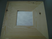
The workshop was based around 2 frames with recesses in the middle, a piece of grey board, some dictionary paper, Grungepaper, some die cuts from Sir Tim of Holtz range and LOTS of paints and stamps!!!

Of course, as is typical of me, I never even thought about taking my camera, but Lou came to the rescue and took a couple of photos for me during the day.  Thanks Lou!!

First we chose some paint and a Distress Crackle Paint to put over the top.  I chose a Lumiere called Halo Pink Gold and Broken China in the crackle.  I painted the Lumiere all over the frame and recess and allowed to dry before applying the crackle using the brush in the pot.  It depends on how thickly you apply the paint as to what size crackles you get.  Thinly is small crackles, thickly in large ones. 

Lynn had cut us a heart out of Grungebord and embossed it with swirls.  We all stuck these onto a piece of grey board, cut to the same size as the frames, with Golden Gel Medium and stuck dictionary paper over it again using the same medium.  Once it was dry we coloured them with Distress Inks.  I chose Spiced Marmalade for the outside and Broken China for the heart.

Lynn had die cut 3 Grungepaper flowers for each for us to make roses from.  I coloured mine with the same Lumiere paint and used Broken China DI just on the edges of the petals.  Once dry I stamped a Wendy Vecchi newspaper column stamp over it to add interest, before beginning to make the rose.  If you're interested in doing this, there are tutorials on YouTube.

Lynn had also given us a couple of swirls from Grungebord and the birdcage cut from a Tim Holtz die.  I again coloured these with the same Lumiere paint.  For the bird I used Viva Precious Metal paint in a blue, browny colour for the branch and finally gave it a golden beak.  I can't remember the exact colours I used.

I stamped a couple of phrases from Wendy Vecchi stamps in the recess of both frames and across the heart too and punched out some leaves using an EK Success Rock Fern paper punch, before the workshop ended.  It was over all too soon.  I was exhausted again, but it had been so worth it!!

A few days later I got to grips with finishing the frames.  I cut another couple of swirls from Grungepaper and painted them with the same colour Lumiere.  I'm really lucky to have some of Jo's crafting stash at my house at the moment as she is having a loft conversion and has had to move out of her house for a while, so I had the paint!  I made another flower from Grungepaper using a Nestability Peony die.  I again coloured it with the same Lumiere and DI I had used on the rose.

Lynn had given us some wire to hang the frames from.  I'm not particularly good at bending wire so I twisted it and used 2 swirls with leaves on the hide it.

Between us, Jo and I had managed to put the holes in the centre grey board using a Crop-a-dile Big Bite.  I lined it up while Jo pressed the lever for the punch.  I just don't have the strength now.  Before we left the workshop, Lynn had given each of us a key cut from grey board using another Tim Holtz die.  I had always planned on putting it onto the grey board with the heart on, but it just didn't look right, so I cut another Grungepaper swirl, painted it and 'dangled' the heart from it, although it is fixed in place with Glossy Accents.

I used the rose I'd made in the workshop (with Lynn's help) on the third frame with 2 swirls and more leaves.


I stuck the wing to the bird before sticking branch the bird is sitting on to the bird cage.  I tried to shape the cage a little first, but couldn't get the branch to balance on the cage, so I ended up sticking it on the back.  Not as pretty, but at least its stuck LOL!!!

I used some beads from one of Gran's necklaces to embellish the bottom of the cage.  My Gran had 2 of these necklaces that she used to wear regularly - one clear, one red.  She was wonderful crafter and could turn her hand to anything, so I think she'd be pleased that I'm using her beads for craft projects.

All of the frames and bird cage are linked together using Tim Holtz jump rings which are invaluable.  I now have it hanging on the wall in my living room.  It was quite difficult to find a place to hang it as it is so long, but it fits there really nicely.  And so to the complete piece...

I'm really pleased with it and its a lovely reminder of a great day spent with friends, new and old - Lynn, Jo, Lesley, Margaret, Bea, Joan, Rachel and not forgetting Lou who took the wonderful 'in progress' pics on the day.

Friday, 30 July 2010

A tale of two mirrors, well OK 4!!!!

I've been to a few workshops since my last post and have suffered the same, if not more, exhaustion.  Two were back to back, the week before treatment so you can imagine how tired I've been!

Anyhoo, onto mirrors.  Every crafter worth their salt has discovered the humble Ikea mirror.  Sold for around a pound, they can be altered in any number of ways and are a great substrate to use for just about any technique.  They come in plain, black and red (at the moment) and I have had at least one in each colour.


I've been to two workshops that used mirrors as their basis and we learned loads of techniques around decorating the mirror.

The first one was a while ago and was a 'Ranger Techniques Mirror' and dealt with the crafting goodies produced by Ranger for Sir Tim of Holtz, Suze Weinberg and Claudine Hellmuth.

First we painted the mirror using Claudine Hellmuth paint.  I chose blue, while everyone else seemed to choose light colours.  Then Lynn showed us how to pour UTEE (Ultra Thick Embossing Enamel)  into molds, and onto stamps with a memory frame on top to create a framed piece of textured UTEE.  As I wobble, Lynn poured mine for me and as you can see the results are fantastic!  Once solidified, I dusted Perfect Pearls over the top to accent the texture.


Then we all chose an image from a pile of pages Lynn had printed out from various free image sites.  I chose a lovely lady and used Sticky Back Canvas to transfer the image using the technique Lynn had used during the Open Day (see previous post).  I left some of the 'lint' from the back of the paper on the image as I liked the way it looked!


Then Lynn showed us how to stamp on Sticky Back Canvas using Golden Gel Medium as a resist and painting over it with a wash to bring out the resisted image.  Unfortunately I just couldn't get my stamping to resist.  I did everything right and tried 3 times (even with Lynn watching me) and I still couldn't do it.  Absolutely no explanation.  I will try it again.  So Lynn had to give me one she had done.

I finished it off using fragments over stamped images, some alcohol inked and some sprockets and gears.

Next to the sprockets and gears is a UTEE flower made from a mold (made with mold 'n' pour) from an ornate button.


And finally the finished mirror.  Excuse the view of my spice rack in the mirror.  Its really difficult to get good light without things reflecting in the mirror!


The next mirror is done with wax.  This was in a workshop done last week called 'Waxing the Melt Pot Way'.

We started by choosing images from a pile Lynn had provided for us again as well as magazines.  Then we placed them onto the mirror to get the presentation right, then heated the wax up in our melt pots.  You have to heat the wood (or any solid substrate you're using) first so that the wax will adhere properly.  This must be done in between each wax layer too.  The paper has to be completely covered in wax by placing it in the melt pot and using tweezers to take it out and apply it to the mirror.  You have to burnish the paper between every paper layer to ensure good adhesion.

Once we done this and had all of our paper waxed to the mirror, we started to apply wax to the parts of the mirror with no paper on, with a natural bristled brush.  Then  we started to build up the wax on the corners on the mirror and add texture using stamps (they must be heated first) and and onion net, but anything can be used. 


We used Perfect Pearls and Bedazzles to highlight the texture on the mirror, and here is the finished article.  I haven't had the inclination to clean the mirror yet, so it still has dribbles of wax on it.  Also the pink feet you can see are from a Piglet beanie I have sitting on the top of my wardrobes!


And the fourth mirror I have to show you is one loosely based on one I saw in Craft Stamper magazine a while ago.  It uses Ten Seconds Studio (TSS) metal with alcohol inks to colour it.  I've made another 2 in plain silver as gifts since making this one.

Wednesday, 7 July 2010

Another workshop and another bout of sheer exhaustion!!

Saturday saw Jo and I attending another workshop, this time run by Lynn Robinson-Hunter and called 'Canvas Creations'.  All we knew was that it was on canvas (suppose the name gave it away LOL!) and that we were gonna be working in a neutral palette, a first for both me and Jo.  We're the ones that are practically guaranteed to have the brightest colours of any workshop which are usually purple and green for Jo and orange for me!!

I drove on Saturday as I felt fine.  We met the other two participants, Joan and Karen.  Joan's daughter Rachel was ill and lying down in the car outside.  Bless her she finally made it into the workshop for about the last hour or so, but she got so much done!!

There were 8" x 8" deep frame canvasses waiting for us on the table with some dictionary paper and a Tim Holtz Ornate Plate. Lynn then began to tell us of the colours we could use which she had totally restricted to the neutral palette and that we had to try and build texture on the frame.

I began by using one of the Tattered Angels Masks on the top left hand corner of the canvas and pushed Golden Fibre Paste through it with my finger - YUK!!!!  I hate having anything gooey on my fingers.  Lynn had gone in search of palette knives, but I just thought 'be brave' and off I went in with my finger.  I was still picking bits out of my nails on Sunday even though I'd washed my hands thoroughly!!!

I then used scrunched up dress making pattern tissue paper crumpled into watered done PVA glue and arranged it in the top right corner of the canvas.

While we waited it for these to dry Lynn showed us how to make flowers from fabric by twisting round.  I had quite a bit of difficulty with this as I couldn't manage to hold the flower as well as twist the fabric at the same time, so Lynn made mine for me.  That's how its so perfect!!


By this time the fibre paste and tissue paper had dried.  For anyone who knows Graphicus you'll know how hot it was in there!!  Lynn asked us all to hand draw a flower (EEEEK!!) onto the canvas and begin sticking paper on as well.  I stuck pieces of torn music as well as a gorgeous piece of hand made paper Lynn gave us onto the canvas with Golden Matte Gel Medium, being careful to leave my 'flower' undisturbed.

Once we'd done that we had our lunch and browsed the shop and bought some 'necessary' bits and pieces with the 10% off for attending the workshop, but who needs an excuse?!

Then we started to paint.  This was difficult for me because although all the colours went together I had a problem choosing which to use!  I started with a Ranger crackle paint which dried almost immediately.  Then I moved onto Ranger Paint Dabbers in various shades and a Ferro paint in Old Brass.  I paint my 'flower' in using paint from a Paint Dabber in copper squeezed on my mat and watered down slightly then drew round it with a black Sharpie pen.

Once I'd finished painting, I used melted wax to dribble down the canvas at strategic points.  In other words, I slapped it on and it went where it wanted!!


This photo shows the wax over the fibre paste and you can see the texture peeking through.  I had (for some unknown reason) decided to trace round the curls in the texture with black.  Putting the wax over it toned it down - thank goodness!!


Once all of this was dry / cooled I applied gold leaf in certain areas just to highlight.  Lynn had to stop me before I went gold leaf mad!!

Earlier we had each done a canvas transfer using Claudine Hellmuth Sticky Back Canvas from images Lynn provided.  I chose the Mona Lisa.  The idea was to put the ornate plate over the part of the image we wanted and place it on the canvas.  I chose her face (obviously!) and Lynn triple embossed the image with the frame in place for me.  You can see the texture of the dress pattern on this photo too.

Once we had the canvas the way we wanted them, Lynn showed us how to cut scallops from the dictionary paper.  One quarter of a piece of dictionary paper was enough to fill one side of the canvas and the depth was right once we'd cut the scallops.  We adhered them using Golden Gel Medium again and once dry we drew round them with a black Sharpie pen like we had with the flower. Then Lynn gave each of us 2 ornate head nails to bang into the sides of the canvas and a piece of wire to hang it with.  I had to get Lynn to do this for me as there was no chance of me bending the wire properly, and me with a hammer ..... NO!!!

Once all of this was done, Lynn gave us each a selection of ribbons to tie to the wire.  I had decided to add another embellishment to the canvas when I got home and was 'with it' again.  I'd told Lynn it would be one of the Tim Holtz Word Keys.  On Tuesday when I felt OK, I tried one of the keys and it just didn't work.  So I made wax seals with silver sealing wax spelling out the word ART and touched them with gold rubbing wax.  That was what I needed to finish it off and it is now sitting waiting to be hung.


And here is the finished canvas.  I love it even though I was completely exhausted after doing it and have only just recovered now!

Friday, 4 June 2010

Creative Road Canvas


I decided I wanted a large canvas to go on the chimney breast wall above my bed.  I got a 27" x 19" canvas to paint.  I knew I wanted to put smaller canvases onto it and decorate them.

I began by putting shades of orange, red and yellow Lumin Arte Radiant Rain  onto the canvas in 3 curved stripes.  This didn't work, so I pained over the whole thing with the same orange as I had used originally.  Unfortunately it didn't cover the red very well, so I used a Stewart Gill colourise in orange and roughly smooshed that over the top.  Then I sprayed Sticky Fingers Fireworks Orange over random portions of the canvas.

Happy with the overall effect, I realised that the colour was almost the same as my bedroom walls and it would just sink into them rather than stand out!  So I hand painted (eek!!!) a frame around the edge of the canvas in a blue Stewart Gill Byzantia paint.  The colour labels have come off the lids of most of my Stewart Gill paints so I don't know their names!!

I got my smaller canvases and placed them onto the larger one to get the placement and sizing right before I painted them - 2 in green Byazantia, 3 in blue Byzantia and 1 in a lighter shade of orange (can't remember what!).

This smaller canvas (left) was the orange one and I made some basic Grungebord flower.  I drew a flower to use as a template onto paper before cutting it out and drawing round on the Grungebord.  I painted them in shades of purple before assembling and using an aqua coloured bedazzles for the centres.  The stems are Grungebord too.

This canvas on the right was done by stamping Paperartsy stamps onto Ten Seconds Studio (TSS) metal in Periwinkle and Appletini using black Stazon.  I then put an Humungo adhesive sheet onto the back of the metal and put it onto cardboard.  The sheet provides a kind of 'cushion' for you to using an embossing tool to go around the stamped lines.  You have to do this before it is cut out as some of the lines are the outside of the image.  I cut it our and used Glossy Accents to stick it to the canvas and had some pieces over the edge to add interest to the overall effect.

This canvas (left) was painted green and I applied a small glittered rub-on of an angel to it with some effort.  The rub-on did not want to stick to the canvas, but I managed with a little perseverance.  It looked too pristine so I distressed using a Tim Holtz Craft Scratcher to scratch pieces of it off.  Then I put a acetate frame from Tattered Angels around the small canvas to finish it off.

All of the other green and blue painted canvases were decorated with TSS metal using the same technique as above using the same colour metals to tie it all together.


So if you're still with me after reading that l-o-n-g post, here is your reward - the finished canvas which has pride of place on my wall!


Hope you've enjoyed this little look at my art.