Pages

Showing posts with label Distress Ink. Show all posts

Thursday, 6 September 2012

Journal Journeys Challenge 12

Oooh look at me - 6th of the month and I'm already entering the challenge.  Makes a refreshing change!

I've had a few comments thanking me for tutorials.  Tutorials weren't my intention.  I intended to put all of the details in purely to remind myself of how I did something and why.  I'm so pleased that helps other people too!

Dawn over on Journal Journeys gave us the challenge on 'friendship' this month.  Its a special month as its the twelfth challenge Dawn has given us and she will enter everyone who posts a picture of their entry on her blog via linky a chance to win some blog candy!!

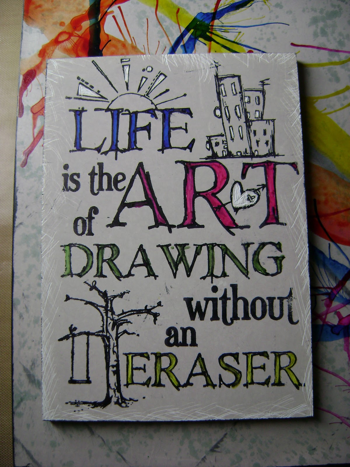
I searched the internet again for some inspiration and I found a quote that says everything that I know makes a friendship a great one.  I wanted to get this feeling over on the page so I wanted it to be quiet and not at all busy.  This'll all make sense when you see the finished page.

I started off by gessoing the page to cover up the ink from last months challenge that bled through.  I'm a messy journaler ;)  I started off by blending Shaded Lilac DI onto the page but it was a bit too pale for what I wanted.  So I used Picked Raspberry DI (a yummy berry pink colour if you've not got it) around the edge of one page and Dusty Concord around the other.  As I continued to blend I noticed that there was a heart appearing on the page where I'd left Shaded Lilac.  Its must've been serendipity cos it works perfectly on the page.

I outlined the heart using a Signo uni-ball in black. It mustn't have like working over the gesso and ink cos the ink only flowed intermittently.  It just makes it look even more hand drawn.  I also drew a couple of lines down each edge of the pages too.

I copied the quote into Word and changed the font to Kristen ITC and made it much bigger and printed it off in grey.  I made sure there was plenty of space between each word so I could cut them out.  I stuck the words to the page and drew lines around them with the Signo uni-ball and traced the letters with a Sharpie to make it look more like handwriting.


This is truly how I feel about friendship.  I can think of no better way to enter this challenge.  Also I've never done a journal page where I've made the words the only embellishment.

Thanks for organising this again Dawn :)

Tuesday, 21 August 2012

Journal Journeys Challenge 10

Over on Journal Journeys Dawn gave us a recipe for our challenge this month - photograph of a person, stamps, design papers (DP's) and Glossy Accents.  I'm struggling with creativity at the moment and although I love this challenge I wanted to do something a bit different (of course!).  I knew which DP's I wanted to use - Artylicious ones I got as a free gift for joining the now defunct Graphicus Guild.  

Then inspiration hit after spending the day with Jo attempting to start and sort her new craft room out.  She had some Simply Stamping Magazines from 2006 / 2007.  I'd never seen these mags as I had real problems stamping when I first tried and was put off completely!  One of the mags had a tutorial on paper weaving and that was me inspired!

I used Mowed Lawn, Squeezed Lemonade, Peeled Paint and Crushed Olive DI's to cover the background of the page in my Moleskine.  I flicked water over page and mopped it up with kitchen towel before drying it with a heat tool.


I chose a script stamp and swirls in various shapes and over stamped them onto the page using Mowed Lawn and Crushed Olive DI's.  I just stamped them randomly cos I knew they'd be mostly covered by the other elements.


I cut the DP's into strips, some with a fancy edge and some with straight edges.  I then followed the instructions in the mag. 

Place the strips on to a Post it note sticky side up and secure them with another Post it on top.
Then its just a case of weaving more strips in and out of the vertical ones.  Continue til you get to the required size.  Now this is where the mag tutorial was a bit vague.  I discovered that the more strips you add the more strength it has when you turn it over to put some glue onto stick it to the background.  

Maybe I should of attached it to some paper before putting it in my journal but I just stuck it (with difficulty) straight in there!


The next stage was photos.  In 2011 some wonderful women in the North West on England decided to do a (tasteful) naked calender to raise funds for the MS Society.  The calendar was a very beautiful and a great success.  If I'd known about it before it was photographed I would quite happily have joined in too.  I wanted to use those images as they celebrate the female form and also (as my Mam said) you tend not to keep calendars but I'll always have my journal!


Now came the difficult part. Dawn had said to use Glossy Accents to highlight our fave bits.  Hmmmm......

I used two main images and then cut the thumbnail size prints from the back of the calendar and highlighted the girls in those photos with Glossy Accents.


I matted all of the photos to pieces of the same DP's I'd used for the weaving and stuck them all on.  And here is the finished page


I'm really pleased with the way it turned out ;)

Thanks for organising this again Dawn.  Please hop over to Journal Journeys to see some lovely journaling and maybe join in next month?

Sunday, 29 July 2012

Journal Journeys Challenge 10

Over on Journal Journeys Dawn gave us the challenge of 'Paris' this month.  Now I could've done a layout about the romance of Paris, but Paris in July only means one thing to me - The Tour de France!!!  I watch it every year and love it but this year was *very* special - we had a British winner in Bradley Wiggins.  So of course my page *had* to be about that.


First a little explanation.  The Tour de France is a bicycle road race around (surprisingly enough) France.  It starts with around a couple of hundred riders and raced over 3,497 km split into 20 stages over 3 weeks.  The final stage every year is ends in Paris with the riders racing down the Champs Elysees and past the Arc de Triomphe.  I find it absolutely exhilarating to watch and I'm constantly in awe of the riders fitness levels!  Bradley Wiggins was the overall winner and received the coveted Yellow Jersey.  Mark Cavendish won the sprint on the Champs Elysees to notch his 4th win there and he's a Brit too!  And so onto the page.

After gessoing the page I scribbled a blue Aquacolour crayon over the page and activated it with gesso to have an almost blue sky look to it.  I took a couple of photos (I know miracle for me!) but the colour didn't show up to well.  I found a free image of the French flag fluttering in the wind on-line and used a glue stick to stick to the page.


I then stamped the bicycle from one of Sir Tim's clear stamp sets around the outside of the page using Memento Tuxedo Black ink and stamped one bicycle in the white portion of the flag in Dandelion Memento ink to signify the Yellow Jersey.


This is when things started to go down hill somewhat and my MS came to play.  I desperately wanted to enter this challenge especially as I was doing a page about the Tour but I sort of struggled from here on in.  So this isn't exactly what was supposed to happen but I think it turned out OK.


I wanted to put the logo for the tour into the page somewhere and found it on-line and sized to what I needed and printed onto tissue paper.  I stuck to the page with Golden Gel Medium (matte).  


Once it was dry I found I stamped the Eiffel Tower and the Arc de Triomphe from Paris Culture stamp plate by Chocolate Baroque onto the background using Black Archival.  I found some more free images on-line of Bradley Wiggins, Mark Cavendish and the peloton going into Paris.  I printed these out and stuck adhere them with glue stick.  I stamped some bunting and stamped the letters of the riders names into it.  I coloured Brad Wiggins name in Squeezed Lemonade DI as he won the Yellow Jersey and left Cav's white as he is the World Champion at the moment.  I decorated some of the bunting with Union Jacks which I drew free hand with Promarkers and stuck them on with glue stick.  I finished the page off with the 'We'll always have Paris' stamp from the Paris Postcard stamp plate from Chocolate Baroque in Black Archival.


If you like the idea of Journaling, why not come and play with us at Journal Journeys.


Thanks Dawn for organising this again!

Sunday, 20 May 2012

Journal Journeys CH08

Over on Journal Journeys Dawn set us the challenge of 'Once Upon a Time'.  She had done the most fabulous page and it was a real challenge to follow it.

I first searched on line for 'Once Upon a Time'.  Of course the bulk of the results came back to the TV series being shown on Channel 5 at the moment.  Really unhelpful :(  But there were a couple of possibilities.  One was Once Upon a Time in the West - a 1968 spaghetti western, and also Once Upon a Time in America - a 1984 gangster movie.  Then I found some quotes and one was exacly what I was looking for.

I wanted the page to look like and old book and began by doing a collage of dictionary paper (from one I bought at a church sale for 50p) over the entire page using a glue stick.  I was going to trim the paper that stuck over the edge of the journal but I kinda like it the way it is.  My initial idea was to use lemon juice over the top of it and heat it to make it look even older.  However because the paper is so old its *very* porous and just soaked the juice right up.  Time for a rethink... aha - antique linen DI which I blended all over the page to age it.


I found the perfect image on Joanna Sheen's Dancing with Shadows CD.  I've had a look on her website and I can't find it so it may no longer be available.  I found some long forgotten paper in the back of drawer (come on we've all got stuff like that!!) and ripped it to make a backing for th image.  I used the same paper to print the quote onto from the PC.

The paper was actually a light aqua colour before I got my hands on it (!).  I crumpled all the paper and image and used Antique Linen DI to colour them.  Then I flicked lemon juice onto them and heated it to get age spots on the paper.  Now I've seen this done but never done myself.  So I started to heat it.  They said it smelled nice but didn't warn me about the smoke that eminates from the page.  I had to open the window and had visions of my neighbours calling the Fire Brigade!!!

Once the smoke had cleared (OK it probably wasn't as bad as that) I stuck everything together with good old double sided tape.  Think thats the first time I've used it in my journal.

And here is the completed page.  Because the dictionary paper came from an old book, the whole page smells like old paper and it adds to the way the page feels.


Thanks for organising this Dawn :)

Monday, 6 February 2012

Pain, Journaling and Art

I've been meaning to post for ages but things have just gotten away from me.

First of all good news - I HAVE NO PAIN!!!!!!!

I've been a lot of pain over the last year or so.  It gradually crept up on me and just didn't go away, no matter what pain killers I took.  The only way I could get relief was to craft but my Muse disappeared.  Think she was scared by the pain lol!!

I've been attending the Pain Clinic for a while and a couple of weeks ago the doc offered me a Lidocaine infusion.  Its a local anaesthetic but doesn't numb when given by infusion.  It just does something to trick the nerves into not giving me pain.  There was no guarantee of it working but I *had* to try.

I had it on 25th January at my local hospital.  I had to go in my wheelchair as I just couldn't walk for the pain.  I went in with a pain score of 10 and came out with a score of zero and could walk again!  I get a little pain at night but the rest of the time its fine and no more pain killers.  Its a really weird feeling.  The first night I couldn't sleep cos my legs just didn't feel like mine.

I've still got very tired legs and I'm having spasms again but my MS Nurse is gonna work it out with my Neurologist to change some medication.

So now that I've written loads I think I should show my completed journal page that I started on new Years Day.

I wrote the wording using a dipping pen and drawing ink.  There were spots of ink all over cos I'm not so good with the pen so I decided to try and cover up the black marks by using Black Soot DI, which of course looked too dark and didn't dry.  So baby wipe at the ready I wiped it off and what I was left with was a darkened version of the original page which I love!

I also promised ages ago to show you my art from the MS Trust Secret Art Show.  There's another one starting in April.  I'm in the middle of doing more pieces for them.

All of the artwork is on heavy water colour paper that the MS Trust send out to the artist.  This one is drawing ink allowed to run over the paper with variegated metal leaf applied in some the shapes that the ink made.

This sold on the night of the first day of the show to the lady who organised the show.  She e-mailed to tell me and hoped I'd not be upset.  Out of all the artwork she saw, it was mine that spoke to her.  I was *chuffed*!!!


This is very obvious to any crafters out there.  I used Crushed Olive and Broken China DI's on the background with some water dripped on to remove some of the colour.  The stamp is from Sir Tim of Holtz.  Its a clear stamp and I got permission from Ranger and Sir Tim before using it.  The wording is printed on the PC and cut up.

This one sold in the first 10 minutes of the show opening!!


This was the first piece I did and I not keen on it.  Cos I'd spent time doing it I sent it in anyway.  I'm not sure if it sold or not.

I used some red paint from Ikea meant for colouring the plain wooden items they sell.  I painted another piece of paper and clagged this piece onto it and it came apart with this lovely pattern.  I used a green paint dabber through small sequin waste and then used yellow paint on a skewer to make the lines.

I've already done one piece for the Spring show and I'm really pleased with it.  Let you see that when its (hopefully) sold.

Friday, 10 June 2011

Angela's wall hanging and more blog candy

A couple of weeks ago one of the girls I met at the hospital while having treatment was the big 5-0!

I wanted to make her something to mark the occasion, but as it had to go through the post I wanted it to be durable.  So I set about making a wall hanging for using 2 Crafty Individuals swirly frames.  It was based on idea I saw in a Graphicus Guild (now Chocolate Baroque Guild) monthly news letter.

I coloured both of the frames with Chipped Sapphire and Stormy Skies DI's then triple embossed the whole of the front frame and just the swirl of the back frame with clear embossing powder.

I stamped Ophelia from Stampsmith onto watercolour paper put her inside the frames and glued the together.  I needed some way of hanging the frame so, following the idea from the newsletter, I used some thick-ish wire.  The only wire I had that was thick enough was copper so I had to use it as her birthday was in a couple of days.

I bent the wire round a paint brush and added some beads before adding it to the frame.  To tie everything together I made some flowers using the smallest flower from the TH Tattered Florals die.  I used tissue from a drinks coaster and Glimmer Misted it with Timeless Lilac and Cherub Pink and used the same technique as in the previous post to make the flowers.  I used curls of copper wire as the centers.


Moira from Happy Daze has a new blog called The Altered Blog and she has a £30 gift voucher plus free p&p to giveaway.

Follow the link to her blog to enter.

Wednesday, 9 March 2011

Jackson Pollock style

On Monday Jo and I had a craft day.  Not really had one for ages due to her working and me not being too well.  So Monday was a complete 'blow out' day where we blew away all of the cobwebs from our muses!

We both worked on 6" x 12" Stampbord blocks, but both did completely different things.  I had decided the night before that I wanted to use some Claybord inks that I had gotten in a random stash box from Graphicus a couple of Christmas's ago.

I coloured the Stambord block with Pumice Stone DI and then dropped the Claybord inks on one at a time and blew them with an air duster (compressed air in a tin which is used for cleaning computers).  I had tried early with a straw, but the effect was sooo much better with the air duster.  I used a heat tool between each colour to stop it going muddy.

I then used one of Sir Tim's saying stamps on an ATC sized piece of Stampbord, already coloured with the DI, and scratched into it before colouring the lettering with Promarkers.  I've always known that I wanted to use this stamp but just didn't know what on.  I think its perfect here!


I then used an Elusive Images (EI) stamp from the Artistic Affirmations theme plate with part of the message being raised up on a domino sized piece of Stampbord, coloured with the same DI again.  Again I scratched into it (I love doing that!!).


The base looked a bit bare in the middle but I didn't really want to detract too much from the background so I used a coaster sized piece of Stampbord, coloured with the DI and blew the inks around again.  I scratched into it (of course!), edged it with black ink and stamped another EI stamp in the middle.


All that was left to do was sort the background as it looked a bit plain.  I used a speckle stamp of Sir Tim, inked with London Fog Memento and stamped it all over the base.  I decorated 3 Stampbord inchies with the inks and scratched a border round them so they'd stand out.  And here is the finshed piece.


And look what I was given yesterday


My Mam and I were both given a rose to mark International Women's Daywhich was yesterday, by a Polish friend called Pawel. He used to be a neighbour of my parents and they always got on well with him.

Apparently yesterday is observed in Poland and he just wanted to mark it with us. You can read about it here.

How sweet.

Friday, 24 December 2010

June's canvas

I met my wonderful friend June when she was having her first infusion of Tysabri, a drug to help modify the symptoms of MS.  She had only recently been diagnosed and when she was moved to a different day for infusion we swapped e-mail addresses.

We've talked through all of our feelings towards MS and I sent her a photo of my MS canvas.  She said she wished she could express her feelings like that, but instead she sent me something about how she felt trapped like a bird in a gilded cage and not able to enjoy her life.

As soon as I saw this I had an idea of what I wanted to do for her, but I wasn't sure she'd appreciate it as our feelings are so personal.  I rang and told her about it before I sent it in case she'd be upset.  She was thrilled that I had made something for her.

I used a 5" x 7" canvas board for the base and coloured it using Broken China and Crushed Olive DI's.  Then I cut the TH bird and bird cage out of grungebord and coloured the bird cage with Crushed Olive DI and embossed it with Vintage Photo Distress EP.  I wanted to make the cage appear to be rusty.

I covered the bird with double sided adhesive sheet and gilded it with gold gilding flakes.  I wanted to gild the bird to show that once it was free it became golden and left the rusty cage behind it.

I used the Sissix 3-D Flower die to cut some Artylicious paper to make roses for the canvas.  Even though I'd cut both sizes I found that the smaller ones fit best.  I used a long handled quilling tool to actually make the roses.  I had to wait for a time when my hands would let me turn the tool to make the flowers.  With a little persuasion and some Glossy Accents they worked!

And this is the finished canvas.  I really enjoyed making it and June loving it has made it all the more special!


Friday, 25 June 2010

We'll always have Paris

Not too long ago I passed the YMCA charity shop in my local town and they had a frame in the window for £2.  It was one of those awful ones (apologies to anyone who has one and loves it) that people used to have in their bathrooms.  It had a wooden frame behind the glass that was used as shelves to have tiny bales of towels and toilet rolls on.  It was a bit like a miniature version of a bathroom.

When I asked to see it, the guy in the shop showed it to me like a fine bottle of wine.  You shoulda seen his face when I told him I wasn't bothered about the front, but turned it over to look at the back to see if I could take it to bits.  Once we got home, my Mam and I wasted no time in ripping into it.  My Mam had to get a screwdriver to the glue under the little ornaments to prise them loose.  Far to dangerous in my hands!!

I'm gutted I didn't take a photo of it in its pre-enhanced state!

I didn't bother sanding the frame or gessoing it as it had been painted with a matte paint.  I used a Stewart Gill Byzantia paint in a blue (the name has come off the lid so no help with the name) and painted 2 coats.  I then used a Stewart Gill Alchemy (same thing with the lid) over the top and accidentally rubbed a little of the paint off while trying the move the frame.  It must've been serendipity as the result was a little of the pinky-peach colour that the frame was originally showed through.  I quickly rubbed some more off before the paint dried!

I painted the wooden frame insert with silver Stewart Gill paint as I wanted it to show off what was in the compartments not fight against them.

I had a bought a miniature Eiffel Tower for 50p in the infamous ex-catalogue shop where I got the mannequins.  I decided the turn the wooden frame so the 'shelves' were vertical and placed the little tower in one of the compartments.  I then borrowed Jo's Paris Postcard stamp plate by Elusive Images part of Graphicus and stamped the cathedral onto acetate before putting variegated metal leaf behind it.  I bent it to fit into the other compartment.

For the background which is attached to the board at the back of the wooden insert frame, I used a piece of paper that came in a Graphicus Guild paper pack.  I creased the paper slightly before sanding it and using a Distress Ink in Vintage Photo.  I spritzed some water onto it too before attaching it to the board.

The glass at the front of the overall frame had to be thoroughly cleaned before I stamped a couple of swirls by Creative Expressions on in Timber Brown Stazon just to take the 'starkness' of the glass away.


Once I had assembled the frame I had to tape the back board to the wooden frame insert and use silicone glue to glue the insert to the larger frame.  It took an awful lot doing, strength not being my 'strong' point (LOL!!!) and then I had to leave this overnight to dry. 

I wanted something on the front of the frame, but not words, so I used a technique I learned from Lynn at Graphicus.  I took 3 Prima white flowers in complimentary sizes and sprayed them Tattered Angels Glimmer Mist in Tattered Leather.  I dried each of them thoroughly with a heat tool before patting them with a Versamark ink pad.  I sprinkled platinum UTEE over the flowers and used a heat tool to set the UTEE.  The result is a flower that looks like metal.

And this is the completed frame.  Sorry the photo's not great but glass tends to reflect!!


It looks really gorgeous with light shining on it (even if I do say so myself LOL!!!)